← All projects
Booking.com

Content guidelines & reporting redesign

Role
Product / UX Designer
Timebound
6 months
Tools
Figma, User Survey, Maze, HotJar, Internal Design System

Where it really started

Three very different audiences - partners, customers, and regulators - landed on the same long-form policy pages.

The branding was plain, navigation was full, the text was too long, and each new legal rule added more writing. The Content Integrity team could not tell if the main problem was the structure, the style, or just visual tiredness.
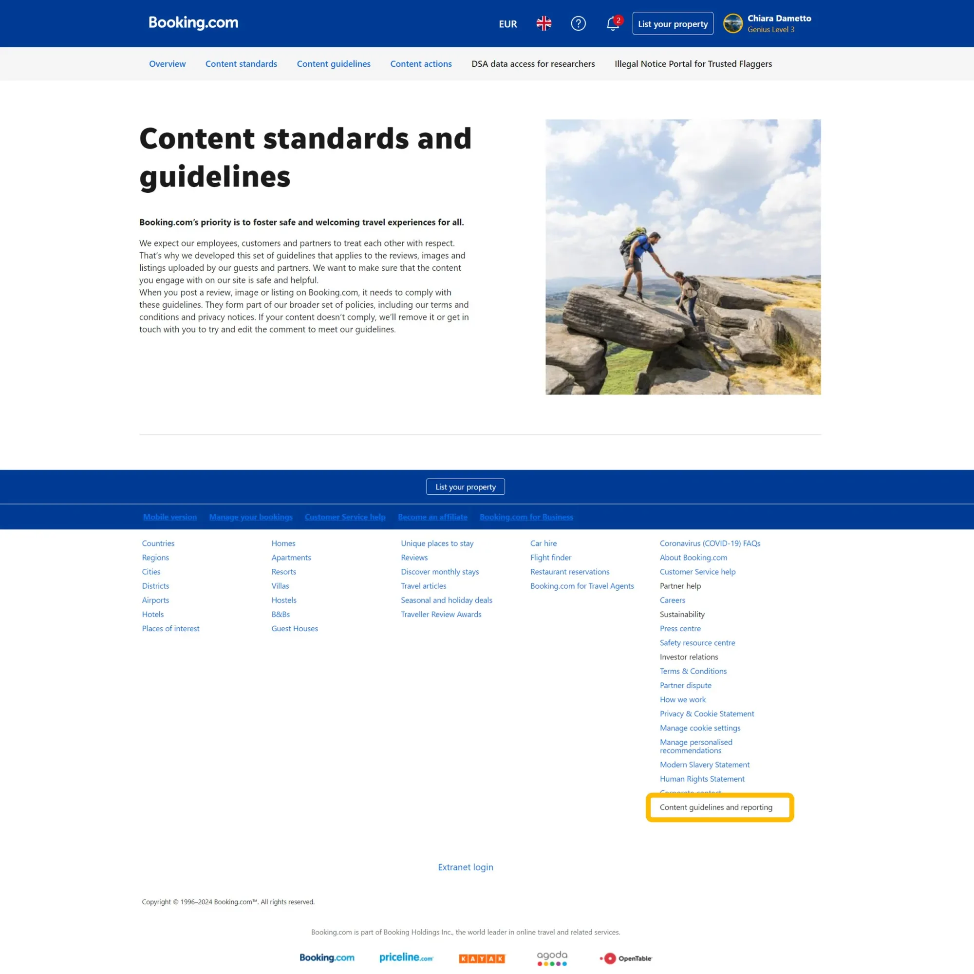
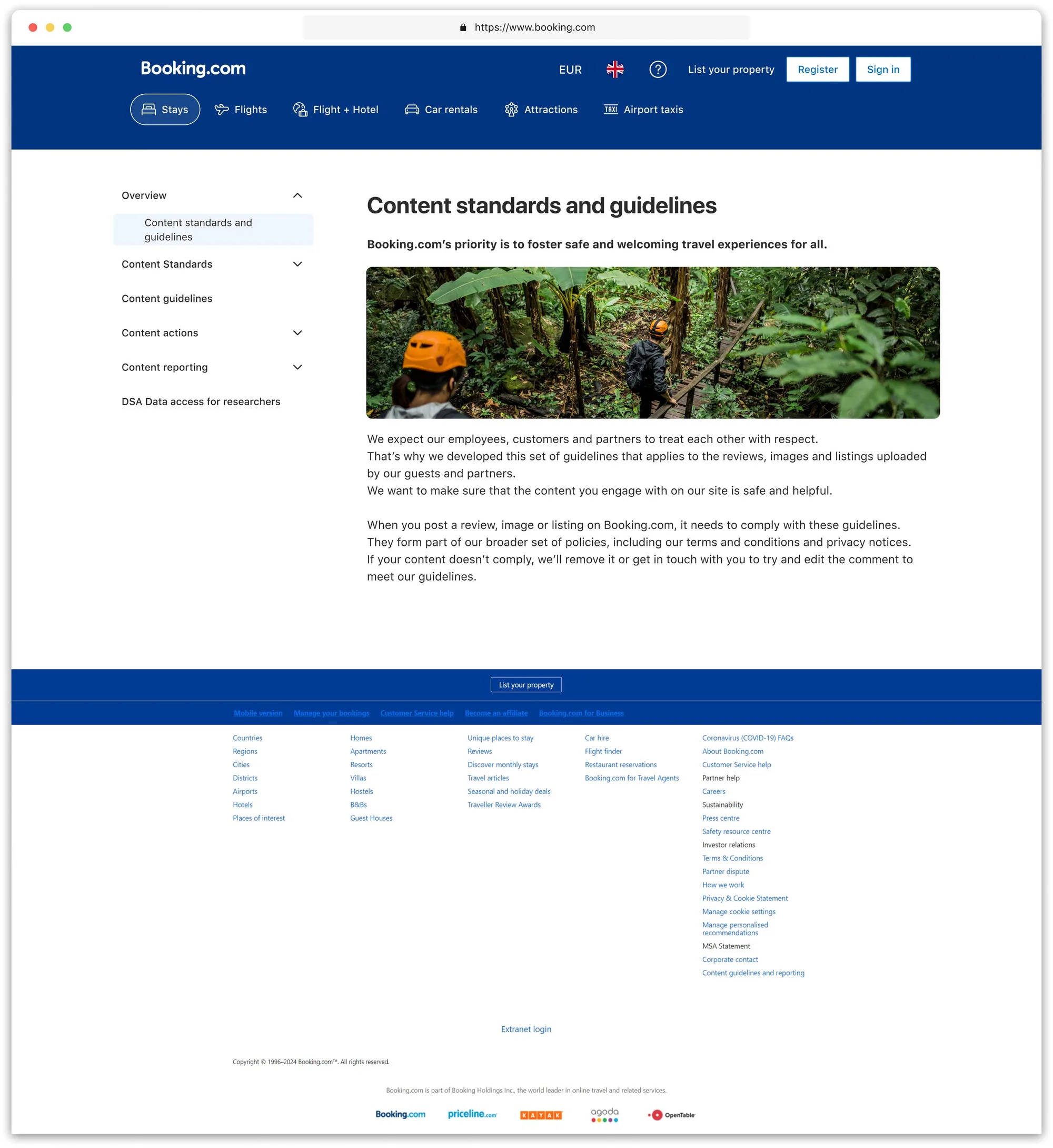
The Booking.com 'Content standards and guidelines' page before the redesign: a six-link top navigation bar and a single column of unbroken policy text, with the 'Content guidelines and reporting' entry highlighted far down in the footer.

How I turned ambiguity into clear moves

Gray areas

  • Top nav capped at six links; legal needed more
  • "Looks nothing like Booking"
  • Walls of text
  • Stakeholders feared future re-writes

What I did with it

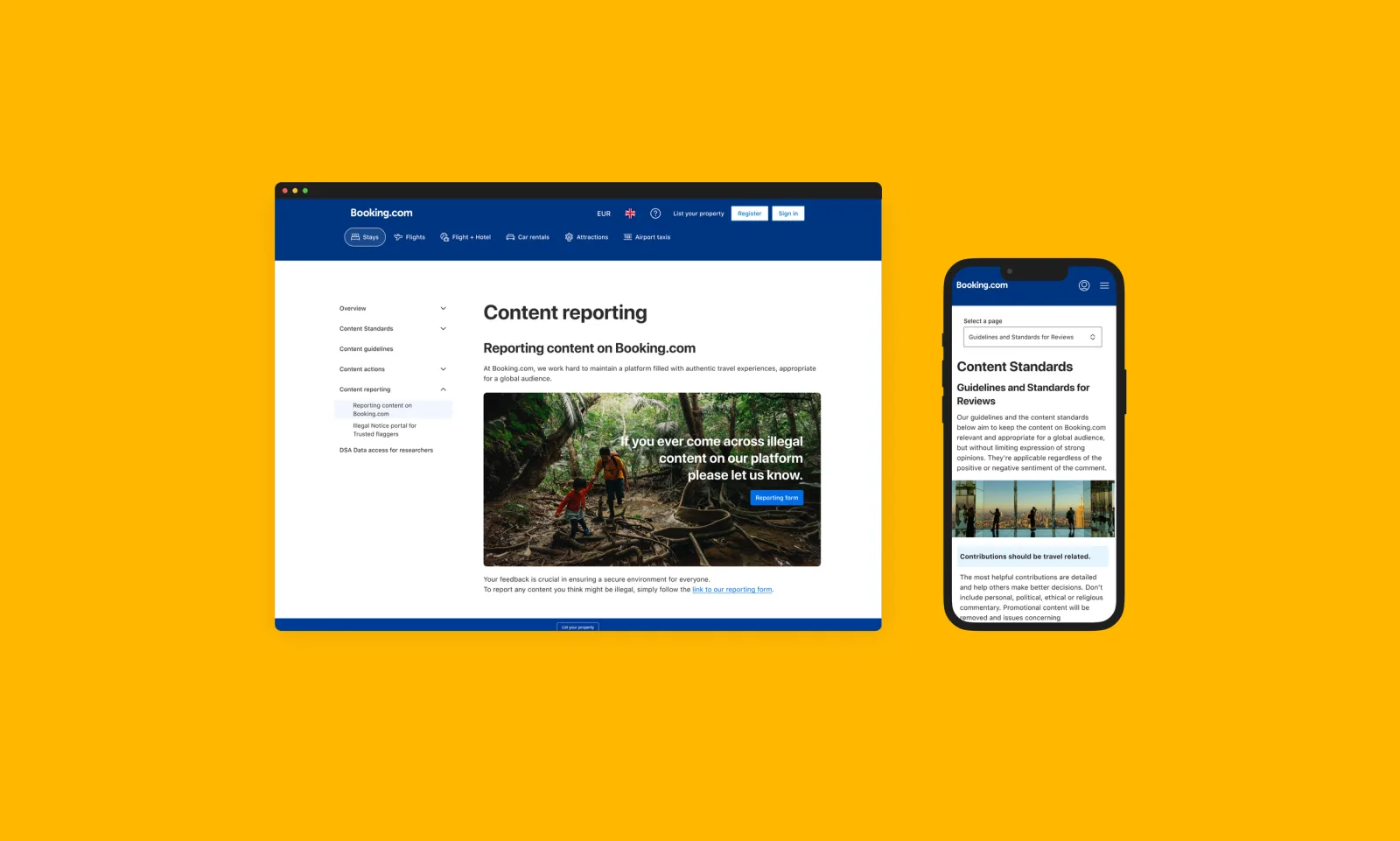
  • Prototyped a side-menu IA with expandable groups and proved it works on mobile in Figma
  • Audited the design system and brought in icons, illustrations and brand colours
  • Chunked the copy, added accordions and improved the typography choices
  • Built a flexible page template and left clear notes and specs in the Figma hand-off

Bumps along the way

Booking's localization caused layout issues - long German and Finnish text overflowed and hid links. We spent a sprint adding responsive text shortening, flexible breakpoints, and a quick translation review process to keep over 40 languages neat.

Stakeholders' opinions interfered with consistency, but internal design systems and elements supported my proposals.

Copy and localization was a struggle in fitting long characters languages into e.g. carousels or elements.

Leading through the process

  • Led a meeting with PM and Content Integrity Lead to clearly define the scope.
  • Promoted early Design-System compliance to get the brand team on board. When a long string broke the new side-menu, I quickly gathered PM and engineers for a 30-minute meeting.
  • We postponed non-essential styling and focused on responsive text shortening and live QA in 40+ languages, with no information lost.

Some visuals of the work done

Redesigned, extended navigation bar (desktop)

1st version

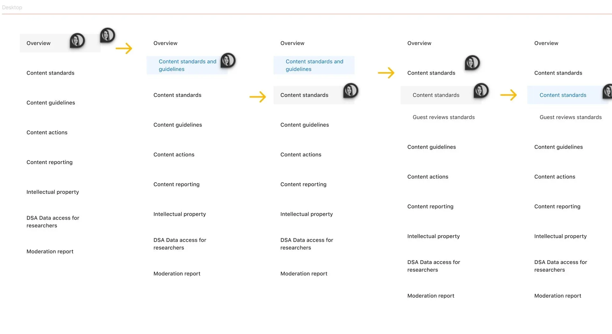
Five desktop navigation states in sequence, showing how the side menu expands 'Content standards' to reveal 'Guest reviews standards' as a child link.

2nd and final version - following PM and developers collaboration

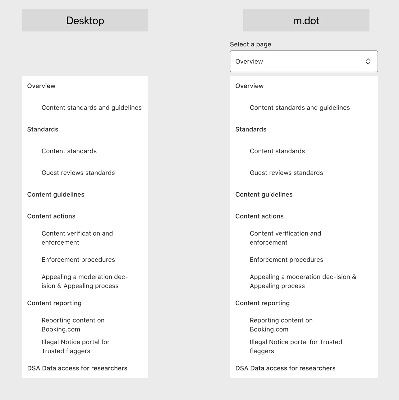
The final side-menu structure side by side on desktop and mobile web, with parent groups Standards, Content guidelines, Content actions, Content reporting and their child pages.
Hand-off note explaining the navigation bar logic: parent titles without children are links, parent titles with children expand to show the child sections when clicked.

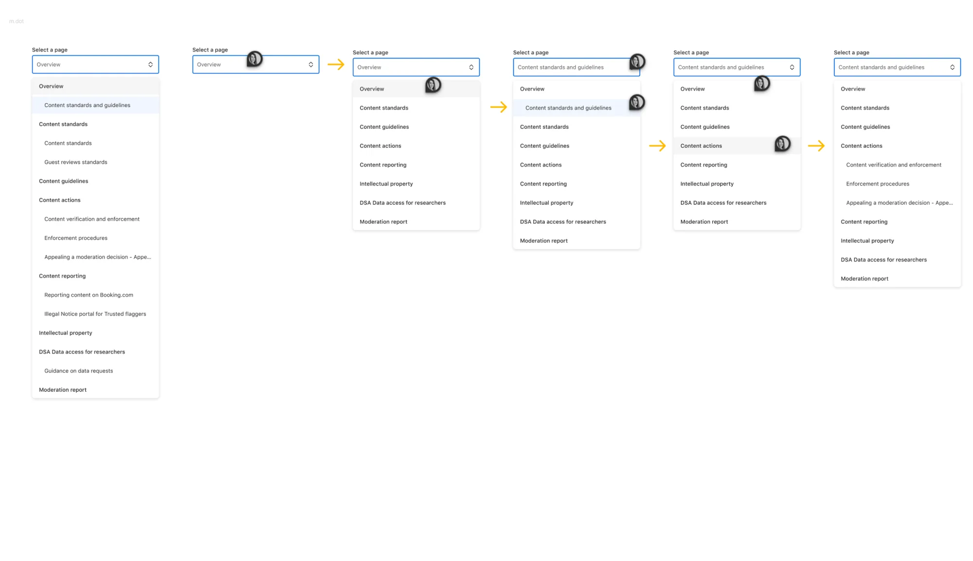
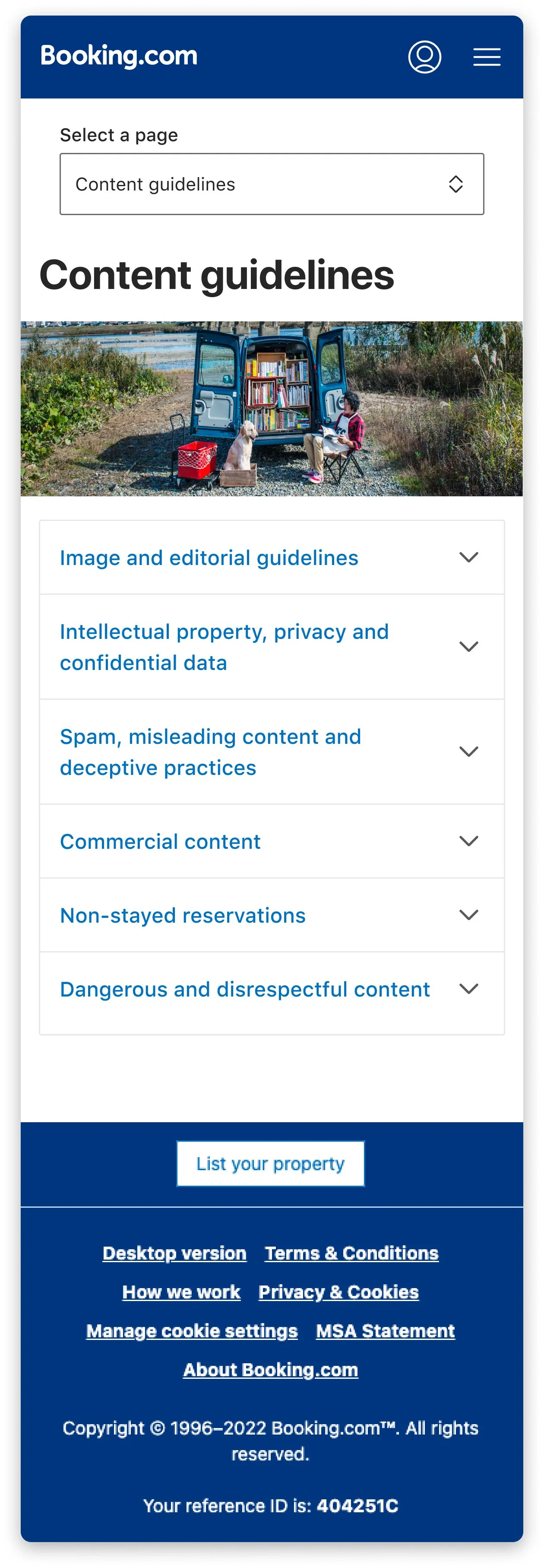
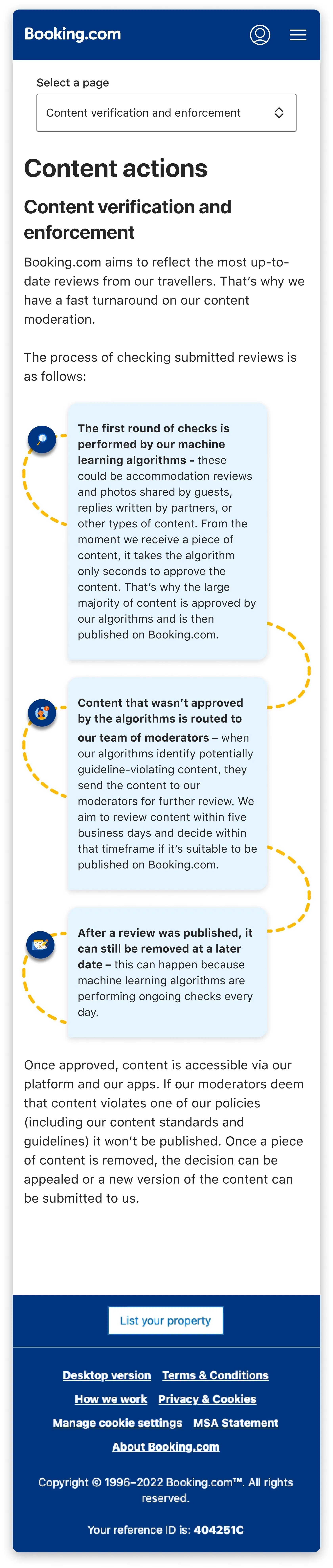
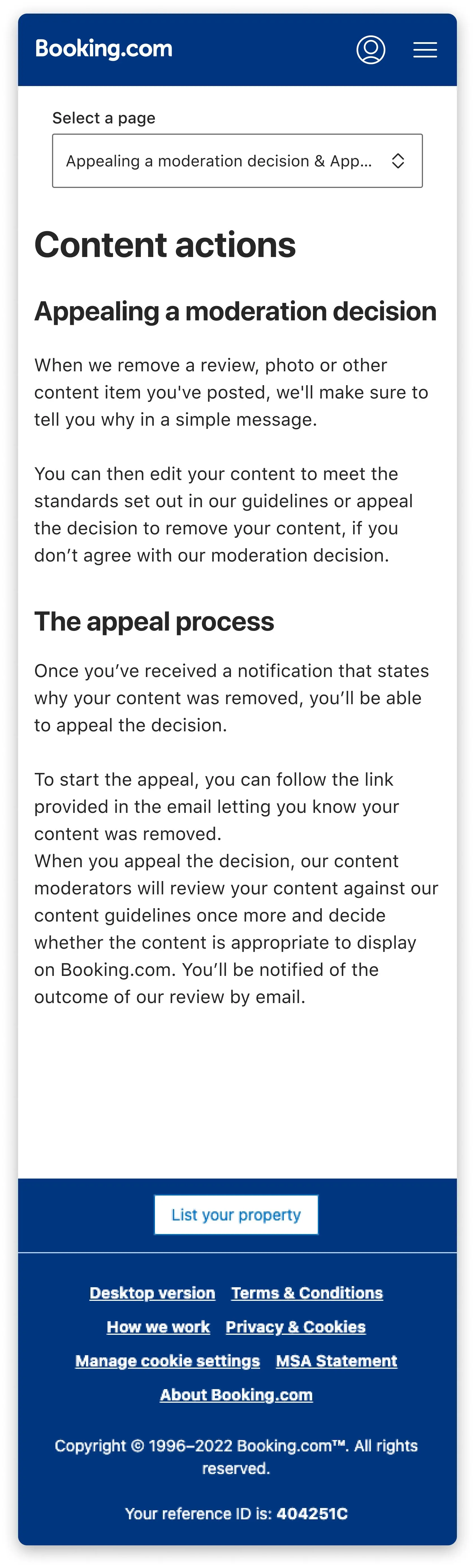
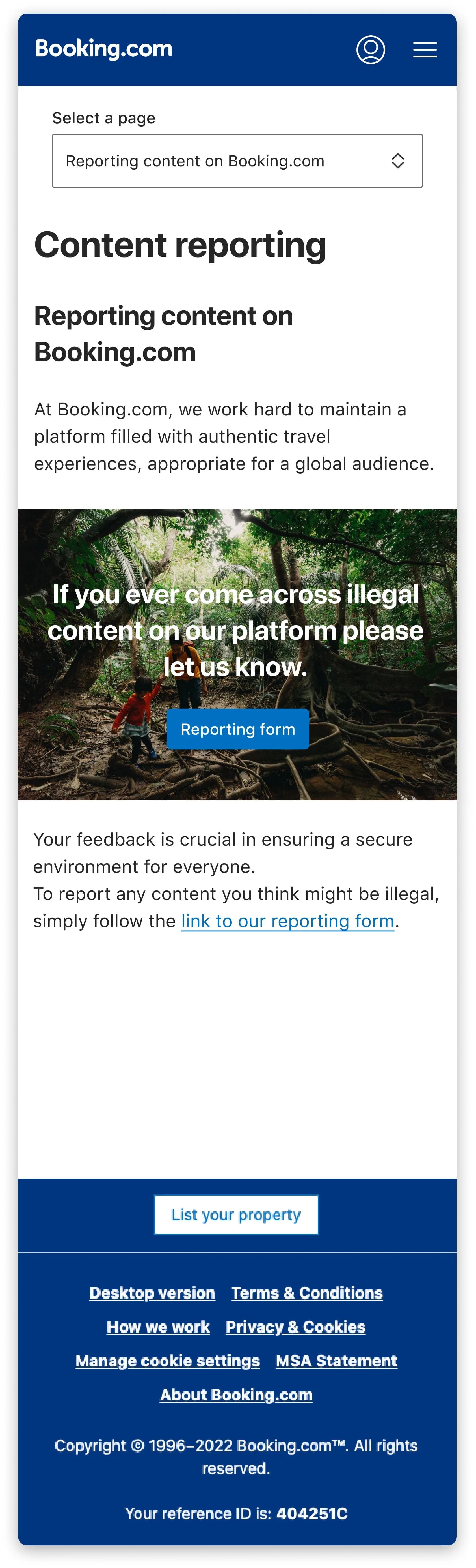
Redesigned, extended navigation bar (m.dot, Booking.com's mobile site)

1st version

Six mobile navigation states in sequence, showing the 'Select a page' dropdown opening, changing selection, and expanding 'Content actions' into its child pages.

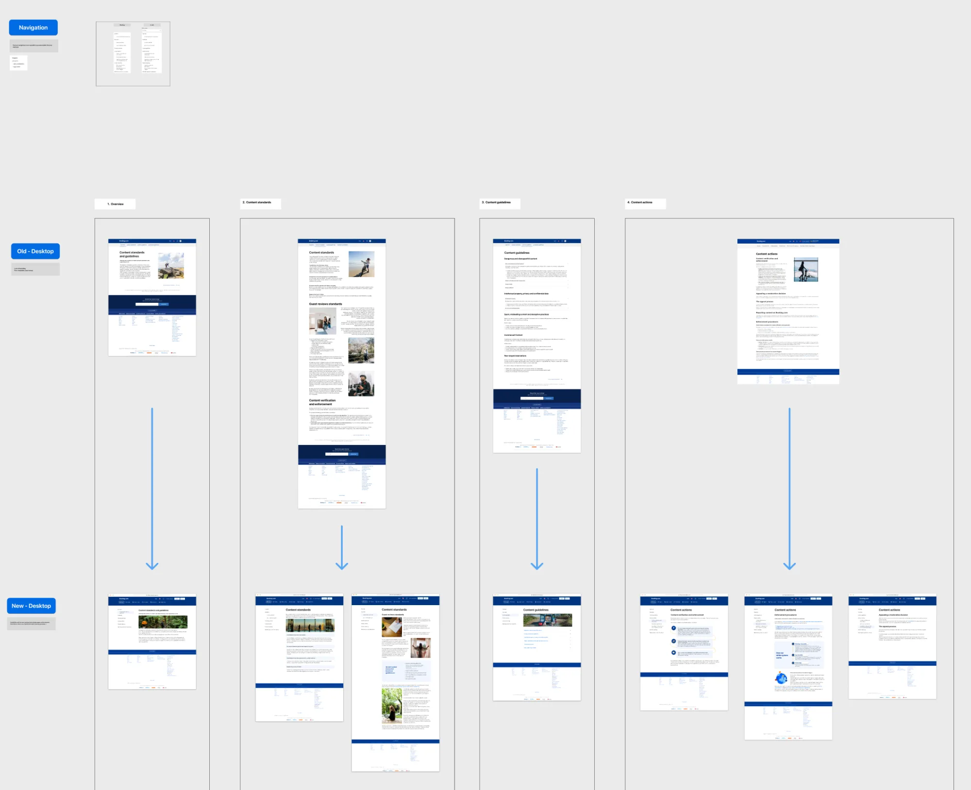
Collaboration with the product and dev team

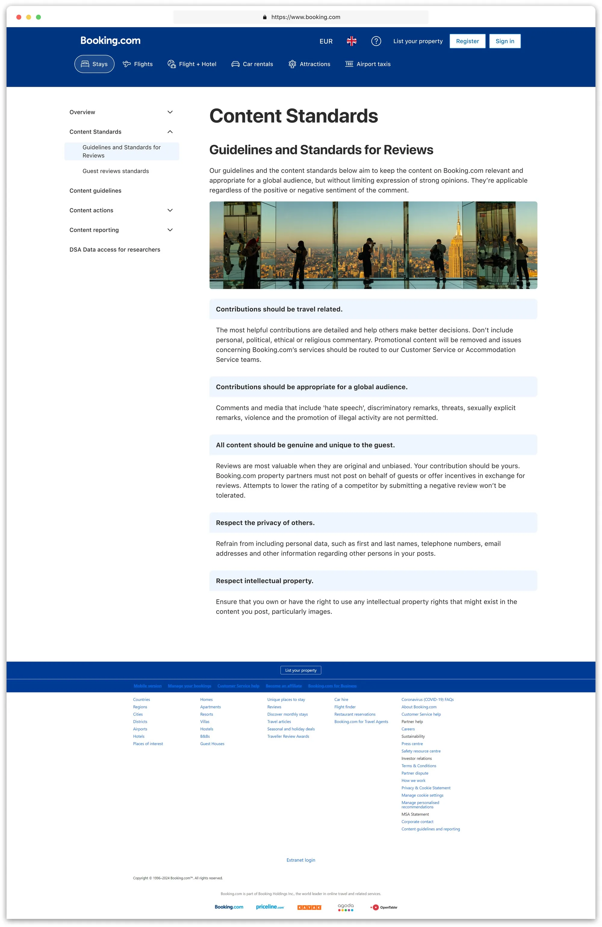
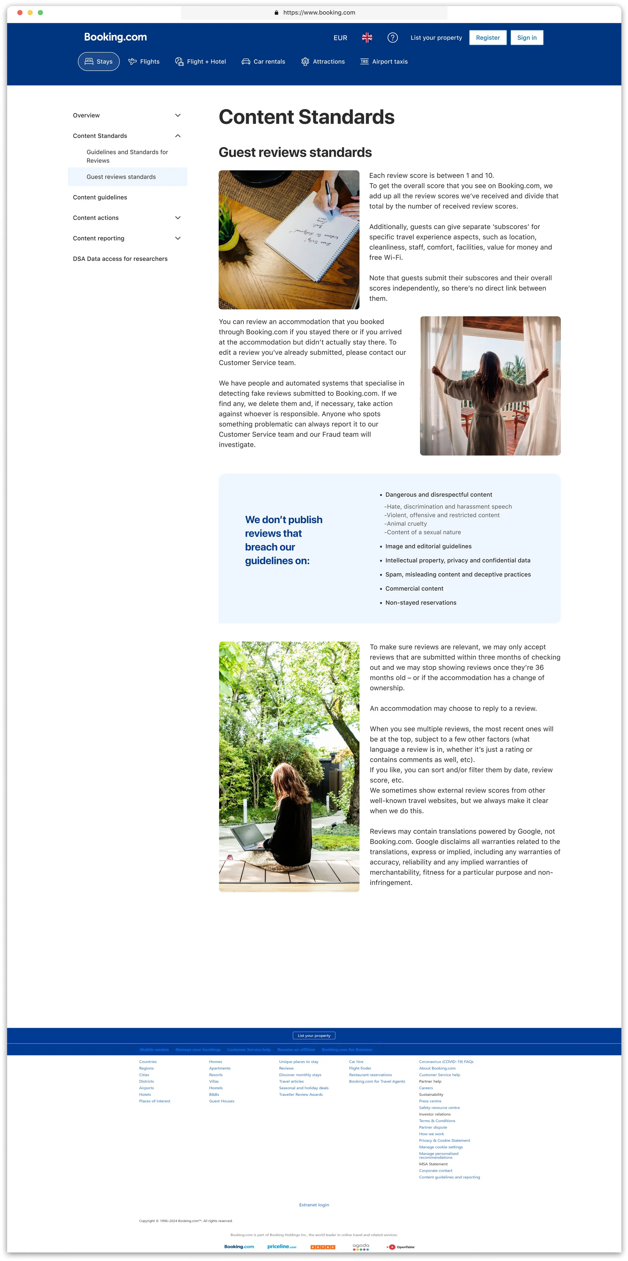
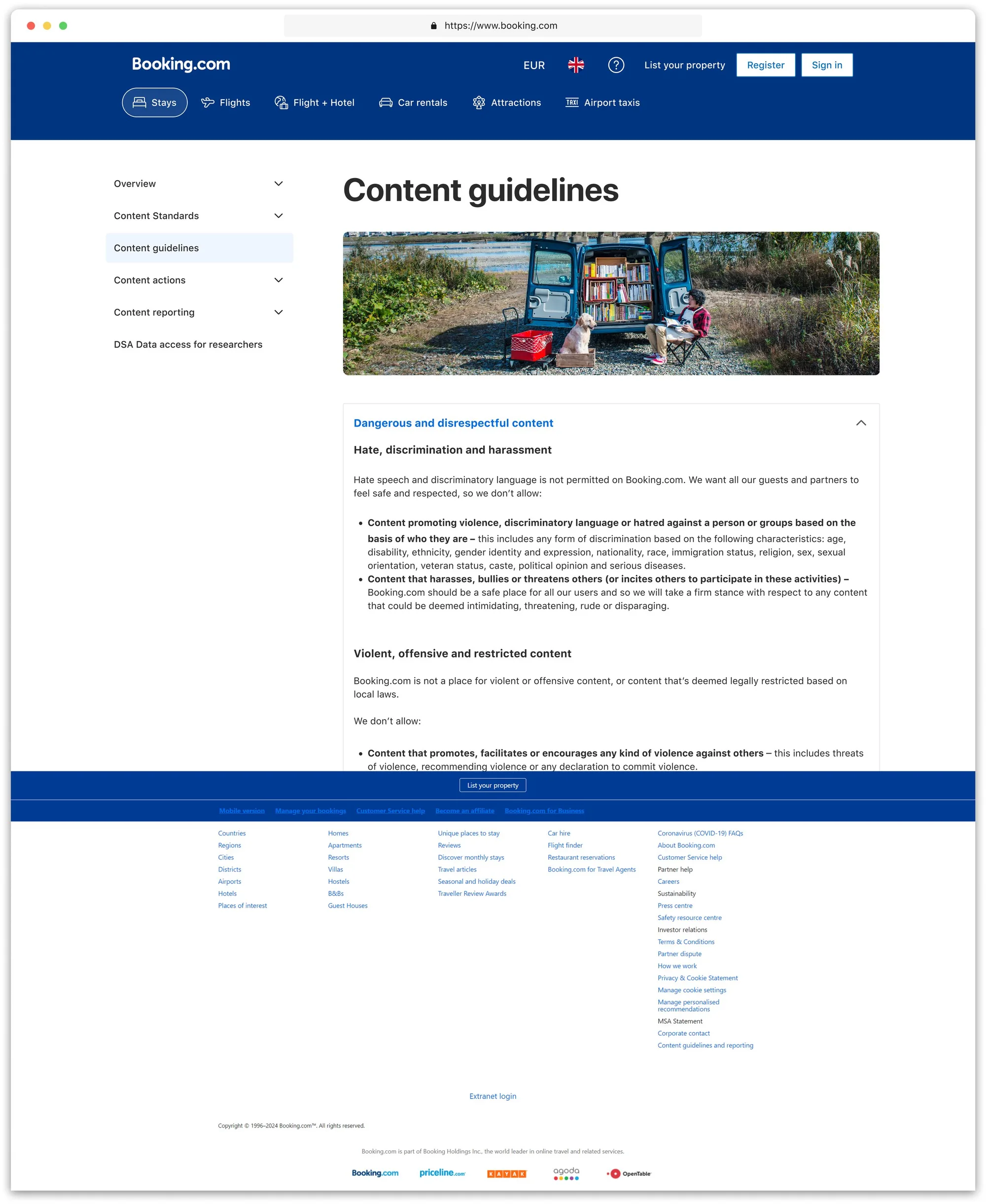
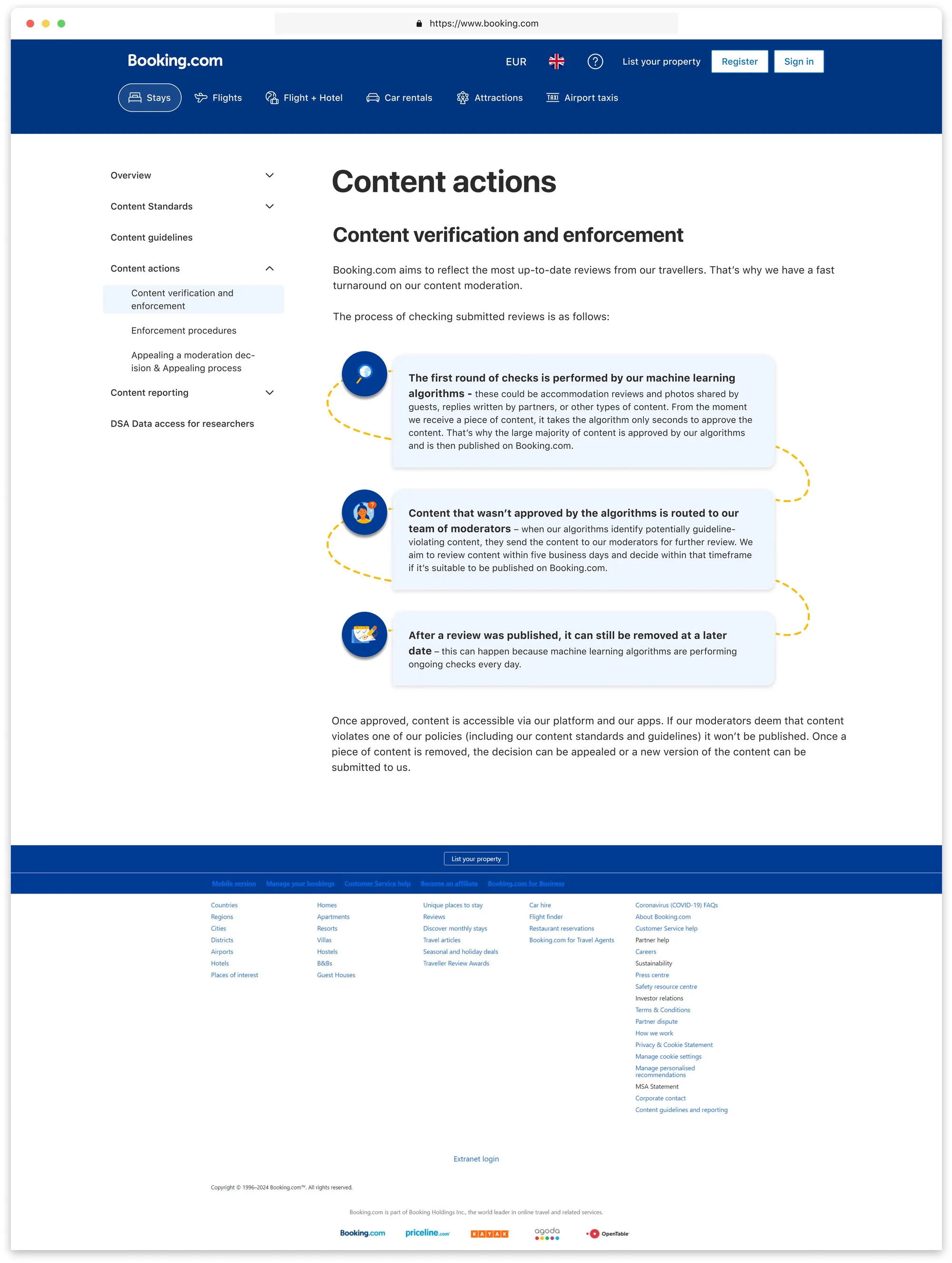
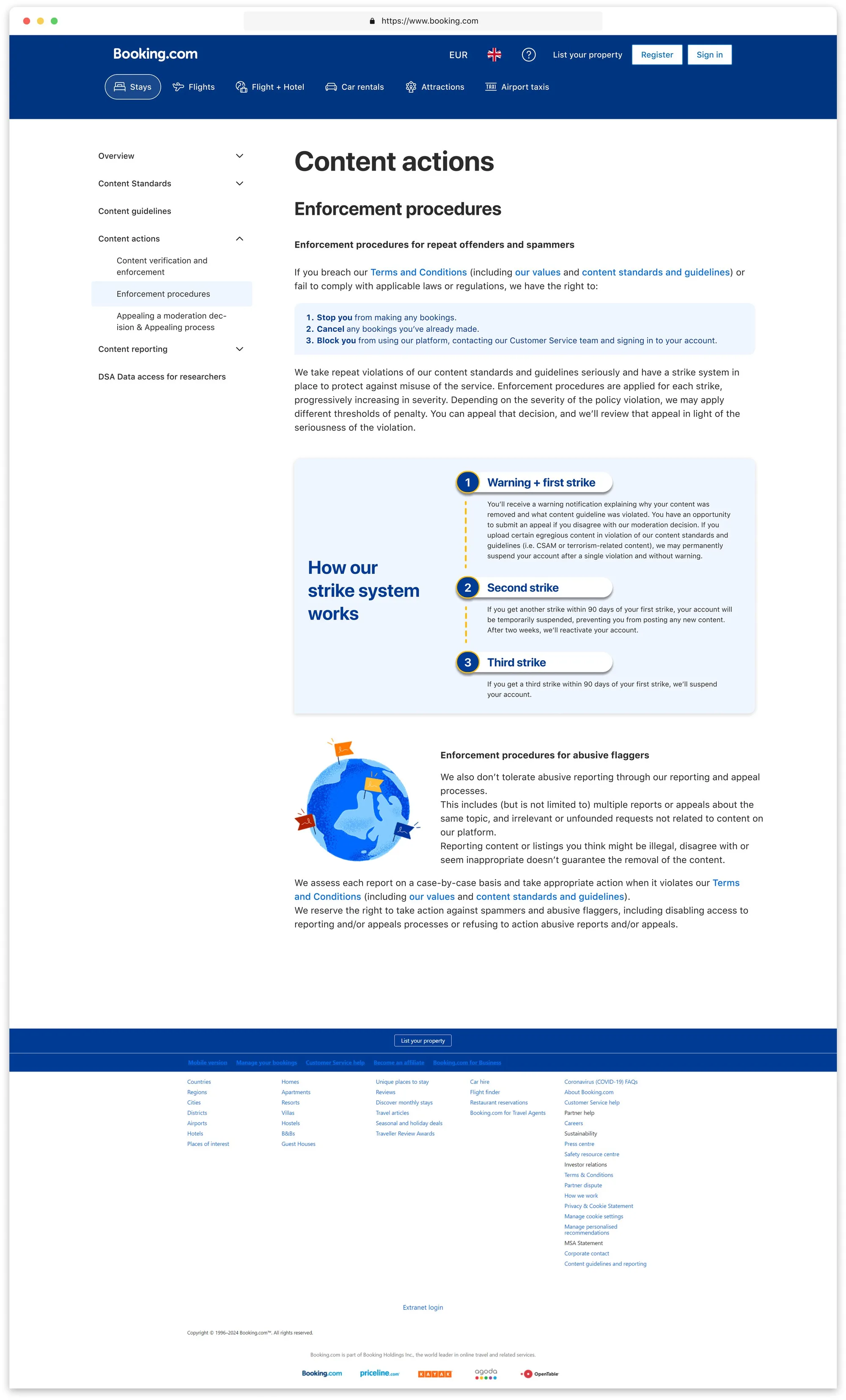
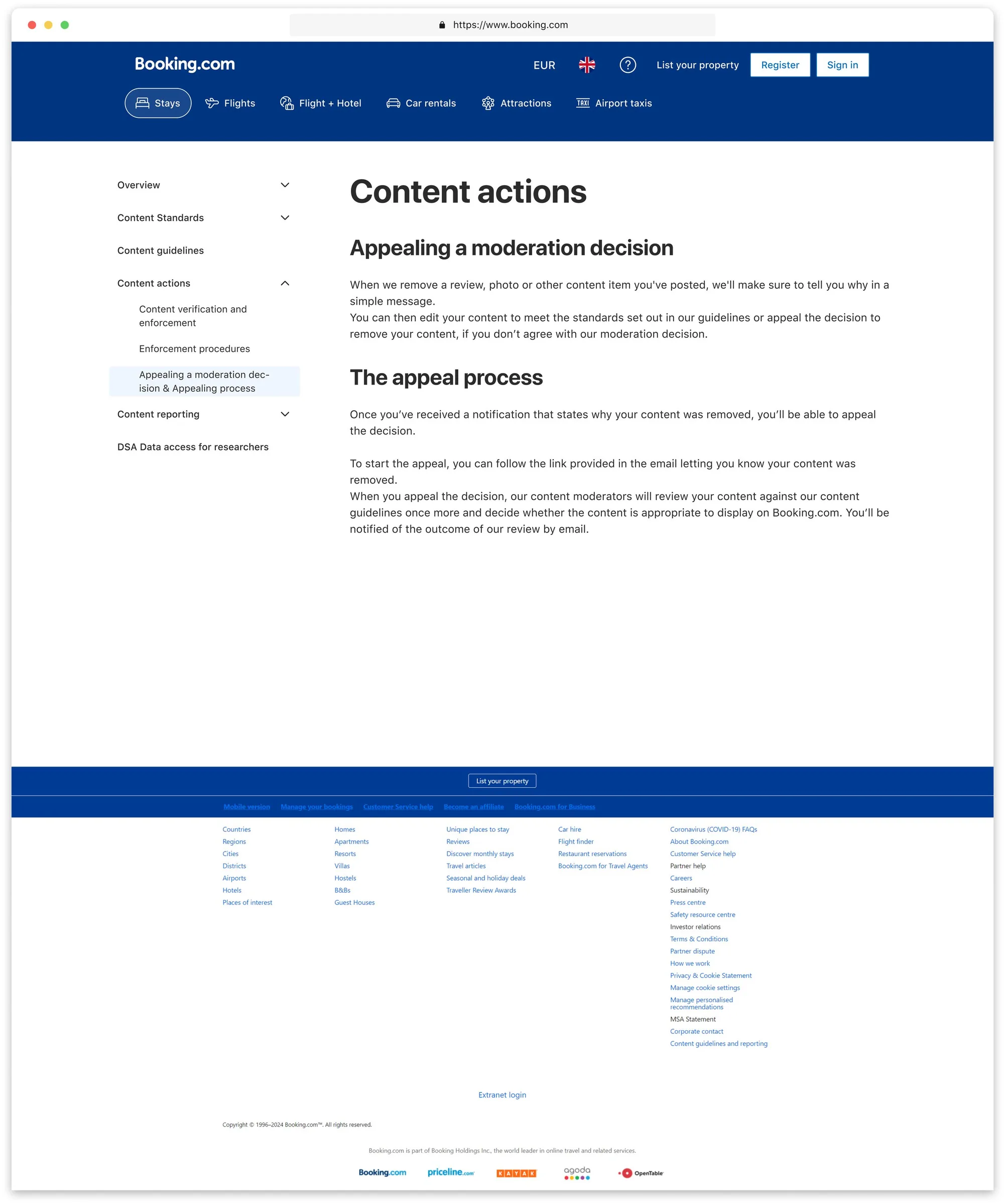
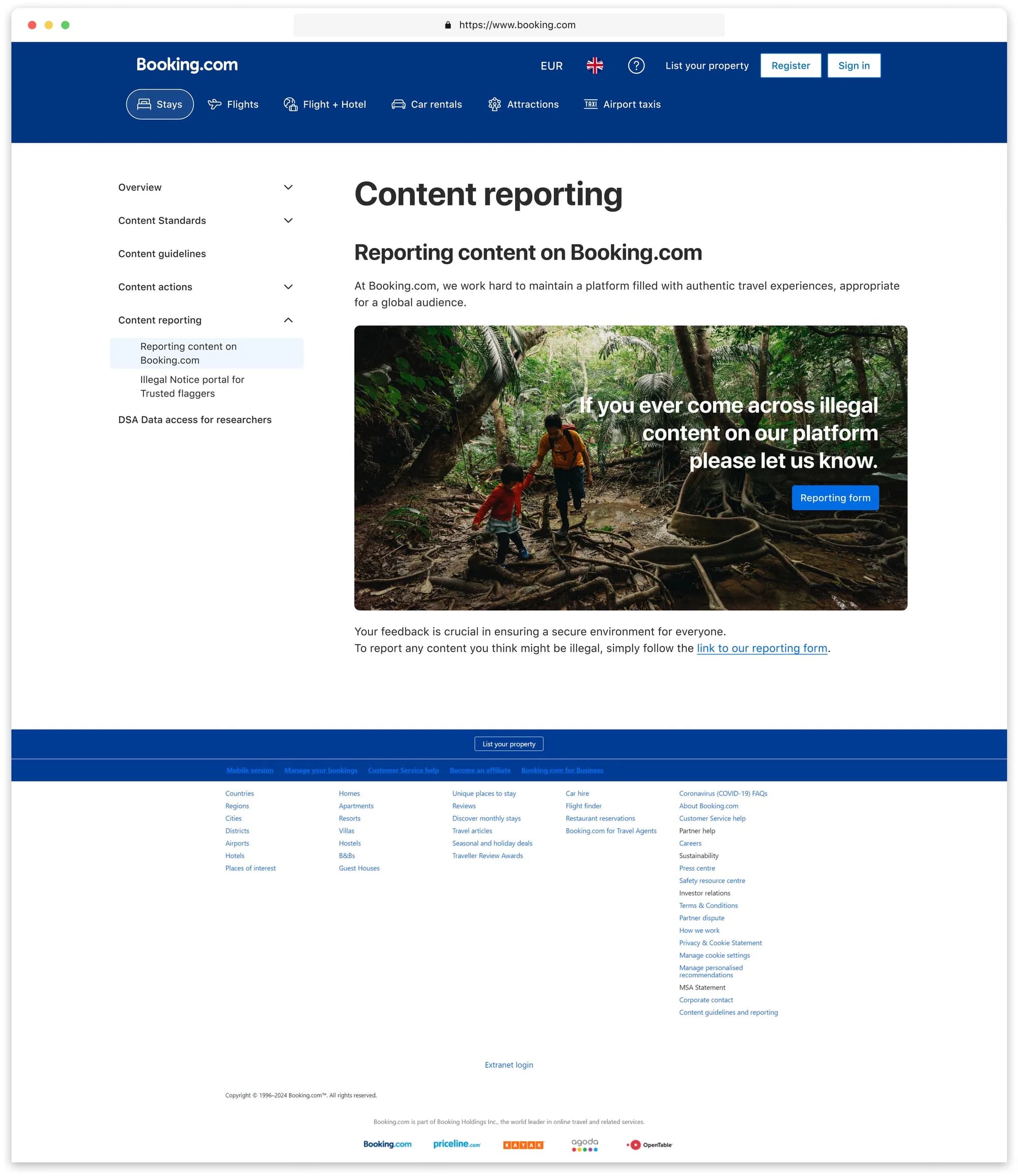
Figma board comparing the old and new desktop pages for Overview, Content standards, Content guidelines and Content actions, with arrows from each old screen down to its redesigned version.

Impact

What shipped & why it matters

  • Side-menu navigation scales indefinitely.
  • Branded UI now mirrors Booking's voice, replacing improvised elements with brand style.
  • Heuristic readability score improved; internal rating 4/5 for standards alignment.

Desktop

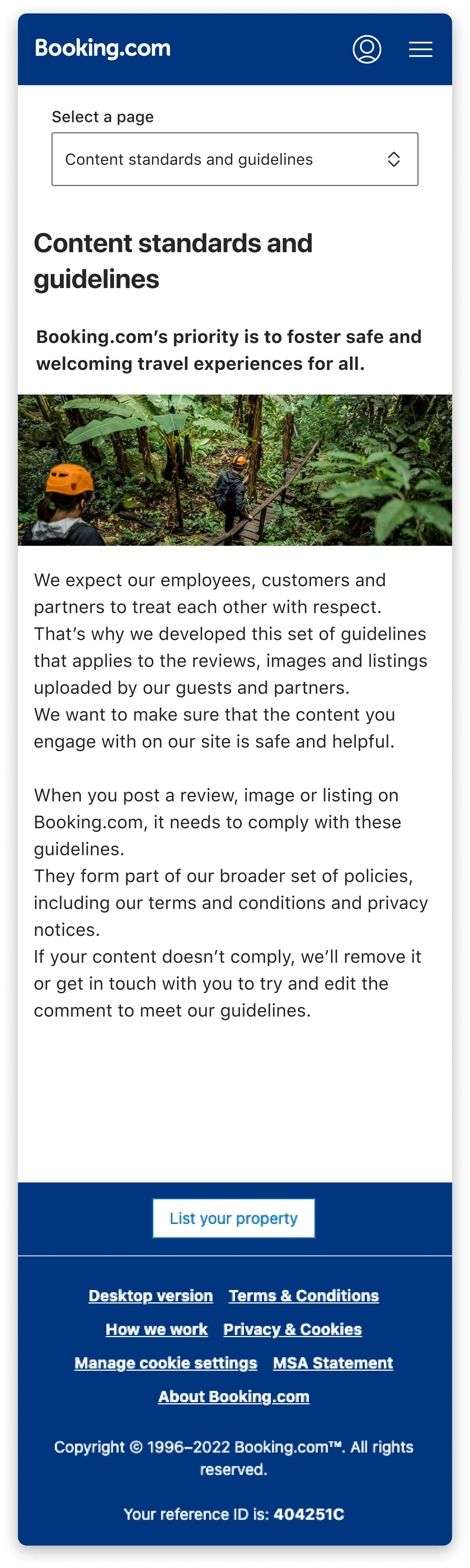
m.dot

Reflection

Policy pages rarely win design awards, but the business cannot do without them. What mattered here was not the new look. It was fewer errors of the kind that turn into partner or regulator disputes.

Three key lessons:

  • Localization is part of product design. Our side menu broke with Finnish text; next time, test long text strings early.
  • Legal approval is ongoing. New clauses kept appearing, so the template had to be flexible. Setting the structure early helped manage changes without redesign.
  • Brand and accessibility matter more than flashy effects.

If I could start over, I'd include localization QA in the first sprint and use real legal text to prototype.

Still, we left behind a system that can take the next regulation without a redesign.