
← All projects
Booking.com

Content Moderation Report (DSA) Visual Design

Role
Visual Designer
Timebound
4 months
Tools
Whiteboards, Figma, Maze

Where we started

Different tracks owned different data (Legal, Brand, Content Integrity, Data Analysts) and the deliverable was a static PDF.

Unknowns on day one

  • Which sections mattered most to regulators versus everyday readers?
  • How do you create "interaction" when every page is frozen ink?
  • How far can we push brand colours without compromising WCAG contrast?
From unknown to firm decisions

Gray areas

  • 60% of draft copy was dense legal text
  • Static PDF still had to be screen-reader friendly
  • Final file hit 18 MB after adding maps and charts

What I did with it

  • Broke content into a headline, a sidebar summary and a deep-dive body
  • Tagged all headings, table cells and alt text in Figma for the PDF/UA export; tested with NVDA until navigation was smooth
  • Re-downloaded visuals as clean SVG and compressed photos, with a 5 MB ceiling

Bumps along the way

Legal first rejected the "plain-language" content; we reworked the wording until it was both accurate and agreed

The first export lost the tag order; we switched to the Axes4 Acrobat plug-in and manually fixed the parent-child tree.

Embedded fonts failed in older Acrobat versions used by regulators; we converted text to outlines for those pages and kept file size low.

Due to NDA, I am not allowed to share content details at this moment.

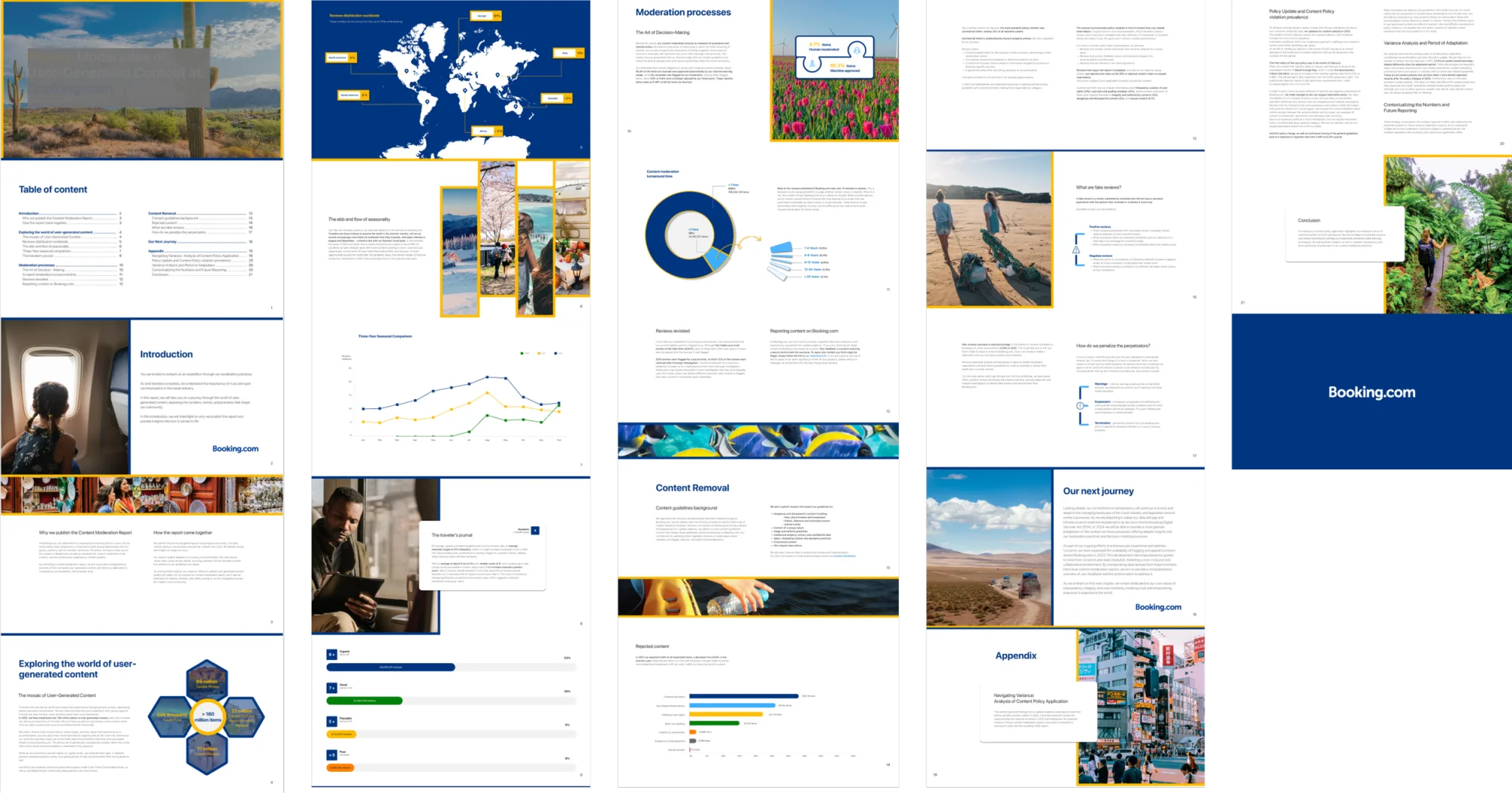
Thumbnail spread of the finished Content Moderation Report: a photographic cover, table of contents, introduction, infographics on user-generated content, a world map of review distribution, seasonality and turnaround-time charts, content-removal and appendix pages, all in Booking.com blue and yellow.

Collaboration moves that kept us on track

  • Legal-design reviews every Friday: turned potential blockers into small copy tasks.
  • Brand design elements built directly in Figma, then handed over for slide decks - zero translation loss.

Impact

What shipped & why it mattered

  • Clear narrative flow: intro → methodology → metrics → glossary; regulators find data fast, public readers skim with ease.
  • WCAG-AA proof: 95 % screen-reader compatibility confirmed in internal audit.
  • Brand alignment: typography and colour synced to the Booking design system.
  • PDF ≤ 5 MB: loads quickly on poor connections and prints well.

Reflection

Designing a static PDF felt like ignoring UX tools, until I saw "interaction" as easy scanning.

Three lessons stood out:

  • Translate first, style later: Simple sidebars helped understanding more than colors or icons.
  • Accessibility saves time: Fixing contrast problems early avoided later changes.
  • Regular legal-design meetings cut approval time from weeks to days.

If I did it again, I'd test page layouts with real legal text from the start; fake text doesn't show spacing issues.

Turning the legal language into a clear, on-brand report cut audit time by 15%. Even a static PDF can do real work for the business.